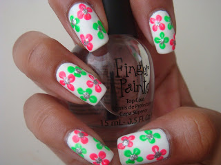
I was watching Food Network Challenge on Sunday and the cakes were supposed to be about the 80's time era. Pretty much everyone was using neon colors, since those were popular back in those days and it just made me crave neon on my nails. I have never worn neon colors on their own because I think they're really loud but lately I've been on a neon buying frenzy. I suppose I owe that to all those girls out there strutting around with their neon colors. I love they way they look on other people, but I still haven't tried the solid neon look on my nails. ( I hope my husband doesn't end up reading this, or else he'll be even more upset about my nail polish buying if he finds out I'm buying colors that I don't necessarily wear!)
I'm still not ready to do the solid neon but I did come up with this idea to incorporate neon without being too loud. These are the products I used: M.A.C. Vestral White, Orly Va Va Voom, Sinful Colors Irish Green, Sally Hansen Celeb City and Finger Paints Top Coat.
I started off with M.A.C Vestral White. I have been searching for a good white color and I still haven't been able to find one. This actually took 4 thin layers to prevent the streaking from showing up. I don't like to apply so many layers but it does end up looking really nice if you just work with it.
I am going to be doing 4 flowers on each nail, two pink ones and two green ones. I alternated the position of the flowers to make them seem random. To make the flowers you just need to place four dots as if dotting the corners of an imaginary square. I did two fingers at a time because the "lines" on the flowers are formed better if the polish is a bit tacky. Once it's a little tacky, I used a dotting tool to make the "lines". I started from the middle of each dot and dragged the polish towards the center. This will give the flower a more realistic look.
Here I did the same with Sinful Colors Irish Green.
After all your flowers are done, using the same dotting tool, I placde silver dots using Celeb City in the middle of the flowers. I chose silver rather than yellow because I wanted to give the design a more blingy look.
It's not visible in the pictures but once you add the top coat. OMG. It just makes the whole design that much better. The top coat fills in all the "lines" that were created and makes it look really flawless.
Here is a sun picture. Even though the design is flowers, I feel that it has that summery look because of the neon colors. Hope you enjoyed!


No comments:
Post a Comment
Please, feel free to leave a comment with your thoughts. I would love to hear your opinions. Good OR bad!